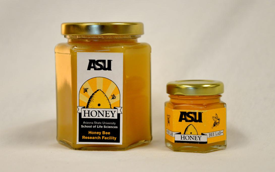
From honey jar labels to giant banners, staying on brand is an important part of maintaining Arizona State University's identity. Collaborating with over 200 designers and programmers within the university allows for a certain structure and consistency. Within this brand however, flexibility allows our designs to stay current while still applying the brand rules.
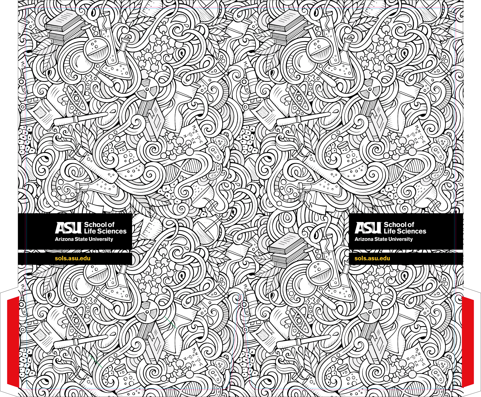
This presentation folder (showed with die cut marks and where the glue should go) was a simple design using tiled stock imagery. It held the papers nicely, and many students colored it in to pass the time while waiting for their advisors.
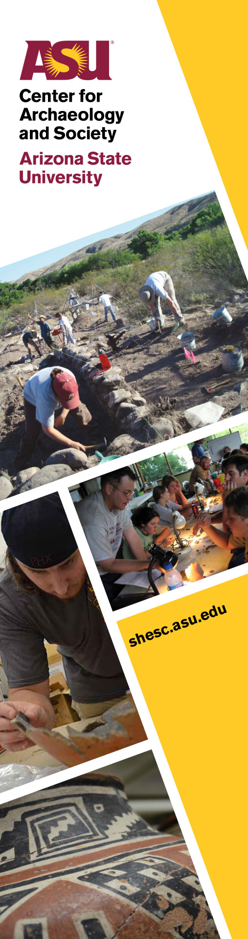
This retractable banner design for the Center for Archeology and Society was setup on an angle, since they wanted several images. The ASU brand prefers just one large image to give the message of confidence and boldness. It's often tough to do with a narrow space like a banner or bookmark, but having it on an angle allows for the bold look since the images show up large and give it the feel of wanting to see more. As per brand guidelines we kept the logo straight, but still works overall.
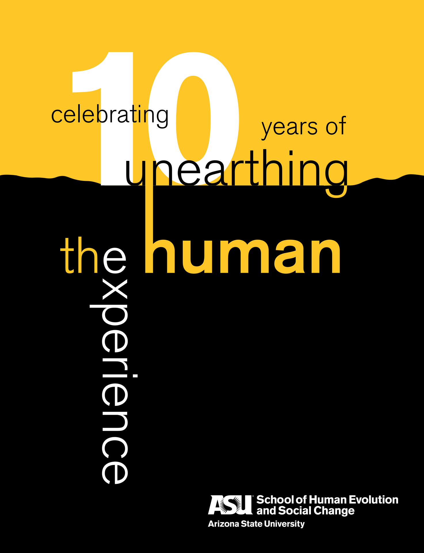
During the 10 year anniversary, the School of Human Evolution and Social Change wanted to gather their images and create a catalog of what they've done. We used this cover for banners, slide presentations, and other giveaway items.
Allowing for flexibility in designs allows for more current designs while still staying on brand.