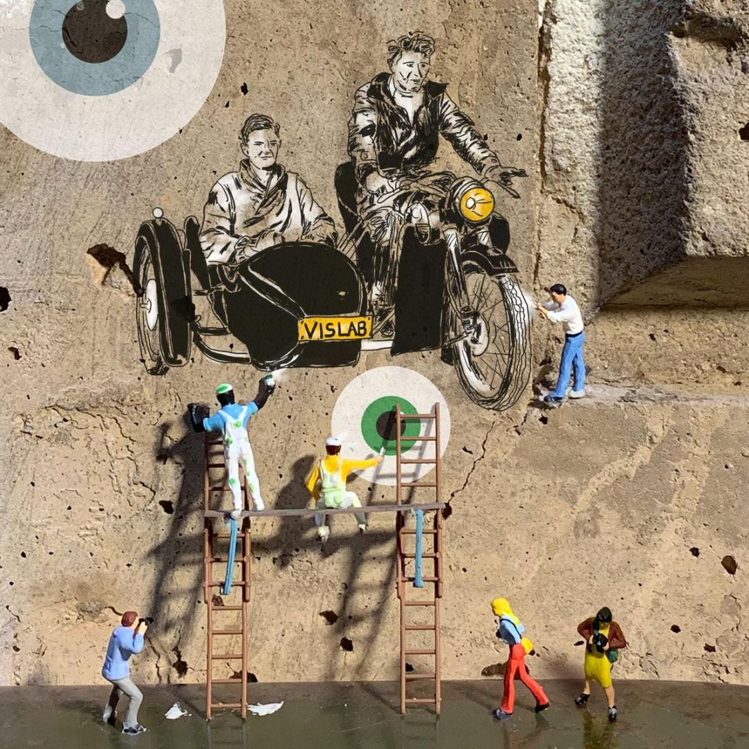
Miniature photography along with illustration overlay.
Additional items
Being part of the Arizona State University (ASU) branding team, which consisted of over 200 staff members who focused on design, writing, programming, accessibility and more, allowed me to have a thorough understanding for defining the ASU brand. It started by reviewing the current designs throughout the university. While some were great on their own, it was clear that there was no cohesion. We had two directions to choose from, have it as a house of brands or as a branded house. Being that the university is so large with some groups having bigger budgets than others, we decided on the branded house direction. In 2015, with bold a bold look and colors, the brand became clearly defined. Not everyone was happy with some of the directions it took, but no one can dispute that ASU had a clearly defined look. With the brand clearly defined, we defined our own team with bold colors and simple shapes.

With Drupal 7 coming to an end of life and giving way to the new Drupal 8, 9 and 10, we felt it was time to give the VisLab a new look, while still maintaining the overall ASU core brand. We knew it was important for us to set aside some time to rework our site since we've been doing it for other groups. We decided on defining our look with miniatures, because we were a small team, but have a hand on many big projects.
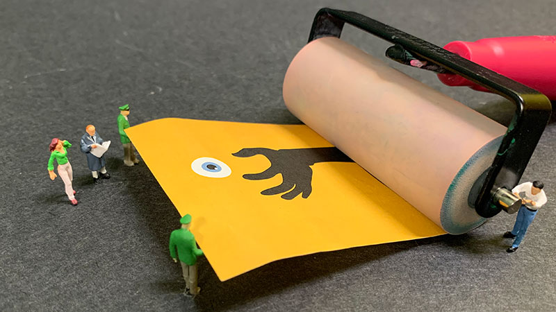
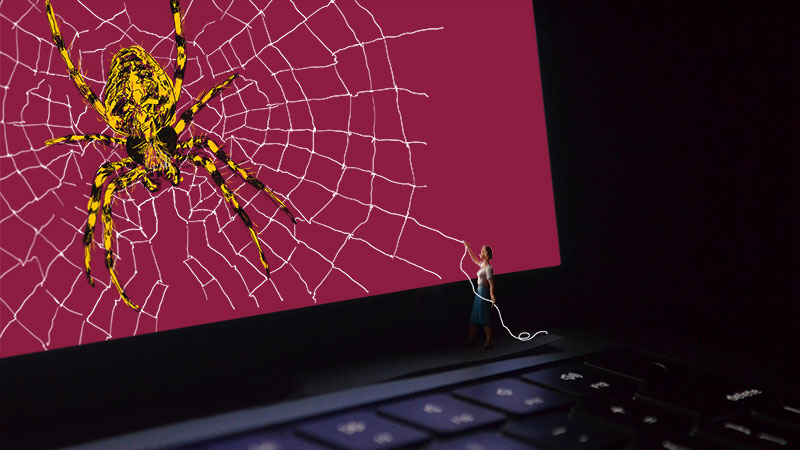
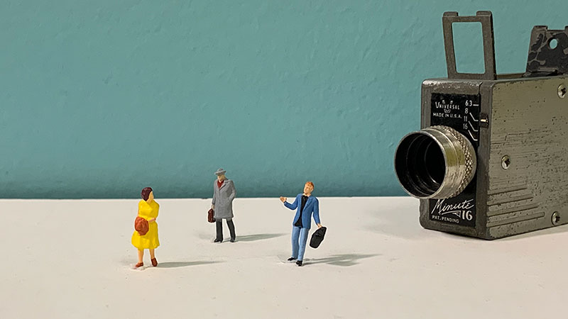
The ASU brand has flexibility to push the boundaries of design, allowing content areas to be unique to each department. We took advantage of that, by using miniatures to describe the VisLab's job functions, such as design for print, web and video.
Our VisLab branding in 2015 was a bold look with eyeballs and contrasting colors. We kept some parts of that as we transitioned to the miniature look.